
Gallery Wall Family Photos: Designer Ideas in Minutes
Key Takeaways
- Pick a gallery wall layout that fits your wall, then keep spacing consistent at about 2 to 3 inches;
- Begin with an anchor piece, balance vertical and horizontal frames, and edit for symmetry or intentional asymmetry;
- Plan on the floor, with paper templates, or a quick photo mockup to avoid extra holes and measuring;
- Mixtiles adhesive, repositionable frames make testing and perfecting your design fast and damage free.
A great gallery wall layout turns personal photos into wall art that feels curated. The secret is arrangement. Below, you will find reliable patterns, sizing rules, and spacing tips that work in any home. You will also see how Mixtiles, lightweight picture tiles, make it simple to place, adjust, and refresh your gallery without nails or tools. Choose your look, then fine tune on the wall until it clicks.
Ready to design your photo gallery wall in minutes? Upload your photos and start arranging your custom photo tiles risk-free.
What is a gallery wall layout (and why does it matter)?
Your layout is the map that turns a group of frames into one cohesive piece of wall art. Common options include clean grids, relaxed staggered grids, two or three piece sets like diptychs or triptychs, staircase sweeps, slim columns, and organic clusters. Keep gaps consistent at 2 to 3 inches. Aim to center the gallery at 57 to 60 inches from the floor for comfortable viewing.
|
Guideline |
Imperial |
Metric |
Notes |
|---|---|---|---|
|
Gap between frames |
2–3 in |
5–7.5 cm |
Use one gap size across the whole gallery |
|
Gallery center height |
57–60 in |
145–152 cm |
Museum style eye level |
|
Width over furniture |
About 2/3 of furniture width |
About 66 percent |
Works well above sofas and consoles |
Which gallery wall layout fits your space?
Match your layout to the wall shape. Over furniture, choose wider arrangements. In narrow areas, stack vertically. On stairs, follow the rise for a natural flow. For large walls, scale up with more tiles for impact.
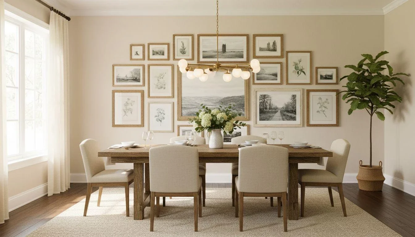
Over a sofa or console
Try a 2x3 or 3x3 grid, a triptych, or a staggered grid. Keep total width near two thirds of the furniture width for balance.
Hallways and narrow walls
Use a vertical column, a slim grid, or a single story row. Leave walking clearance while keeping gaps tight.
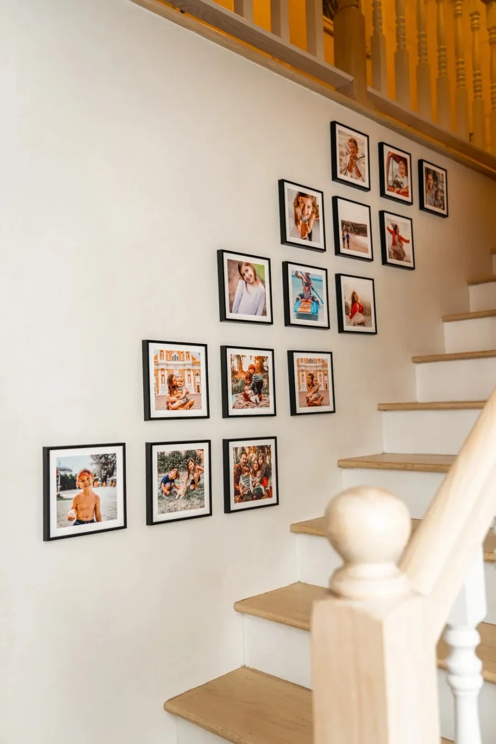
Staircases
Mirror the incline with a diagonal sweep or a staggered pattern so the gallery rises with the steps.
Large feature walls
Build bigger: 3x3 or 4x3 grids, wide staggered grids, or organic clusters of 9 to 15 frames.
How many frames and what sizes should you pick?
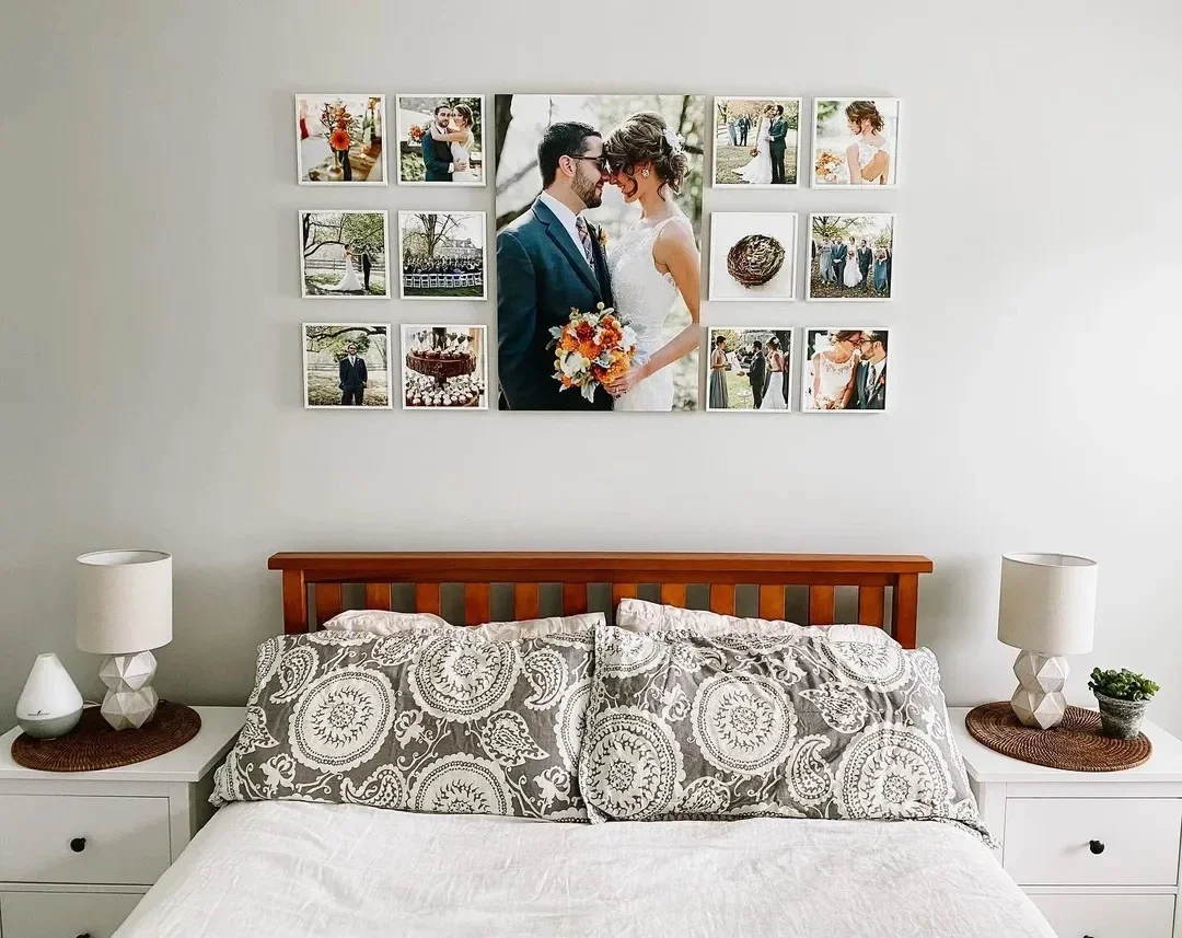
Use one larger anchor, then mix medium and small frames for rhythm. Align edges for a formal look, or offset slightly for a relaxed vibe.
Quick sizing tips
Select a size family that suits viewing distance. Larger tiles work best across rooms. Smaller tiles shine in corridors or nooks. For more help choosing dimensions, see our guide to canvas sizes for walls.
Spacing & alignment cheat sheet
Keep a 2 to 3 inch gap, then align either centers for organic clusters or outer edges for crisp grids.
Test drive your arrangement without holes. Our personalized canvas prints stick and restick until they're perfect. Place, step back, and adjust until it's just right.
How do you plan a gallery wall without making holes?
Mock it up first, then commit. With Mixtiles, you can even plan directly on the wall and refine live.
- Floor mockup: tape out wall dimensions and arrange frames within;
- Paper templates: cut paper to frame sizes, tape, adjust, then mount;
- Photo mockup: snap the wall and sketch placements for scale;
- Use Mixtiles: place tiles, nudge spacing, and swap images in minutes.
How do you make it look cohesive (even with mixed photos and art)?
Pick a simple thread, then repeat it. That could be color, tone, frame finish, or consistent spacing.

Color and tone: Choose a palette or a shared mood like warm neutrals or airy cools so the gallery reads as one design.

Orientation and balance: Alternate vertical and horizontal pieces. Spread darker or busier images evenly across the layout.

Frame consistency: Use one finish for polish, or mix two to three finishes intentionally. Mixtiles Gallery Wall Kits make this easy.
What are foolproof gallery wall layout formulas to copy today?
- Balanced Grid: 2x3, 3x3, or 4x3 for clean symmetry that suits modern homes;
- Staggered Grid: rows offset slightly for a relaxed gallery look;
- Triptych or Diptych: two or three larger tiles for minimal effort and strong impact;
- Staircase Sweep: follow the rise for a seamless stair gallery;
- Organic Cluster: start with one anchor, then tuck tiles around it with tight, even gaps.
A standout gallery wall layout starts with the right pattern, then succeeds through spacing, balance, and cohesion. Plan quickly, keep gaps consistent, and edit until it feels just right. With Mixtiles adhesive, repositionable frames, you can perfect your gallery wall layout in minutes without nails or measuring.
Create your dream picture wall today. Upload your photos to Mixtiles, pick a layout, and turn your memories into beautiful canvas pictures delivered to your door.
Frequently Asked Questions
What’s the golden rule for a great gallery wall?
Keep spacing consistent (about 2–3 inches), center the overall arrangement at 57–60 inches from the floor, and balance vertical and horizontal pieces. Distribute darker or larger images evenly and aim for a gallery width around two-thirds of the furniture beneath for harmony.
How do I plan a gallery wall layout without making holes?
Measure your wall, choose a layout (grid, staggered grid, cluster), and mock it up on the floor or with paper templates. Start with an anchor piece, keep 2–3 inch gaps, then adjust. Repositionable frames like Mixtiles let you test and perfect without holes.
What exactly is the 57-inch rule?
The 57-inch rule places the artwork’s center 57 inches from the floor (roughly average eye level) so viewers don’t strain. For gallery walls, position the center of the entire arrangement around 57–60 inches, adjusting slightly above furniture or for very tall ceilings.
Are gallery walls still in style in 2025?
Absolutely. Gallery walls remain stylish in 2025, trending toward cleaner grids, cohesive color palettes, and a mix of photos and art. Lightweight, damage‑free frames make them renter‑friendly and easy to update. Modular options like Mixtiles keep the look fresh with minimal effort.
Be the first to know — deals, news & decor ideas.
By clicking you agree to the Terms of Use & Privacy Policy